Results and conclusions

This section starts with a seminar on the method and results as discussed in the article. On the next page we will start dreaming up loud about evolution, correlated mutations, signalling paths, and how EV analysis can perhaps even help predict structures from MSAs.

Seminar that runs parallel to the article

Introduction to EV-plots

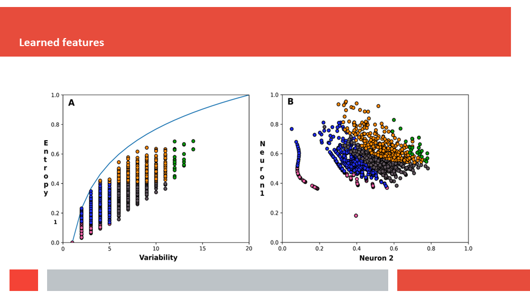
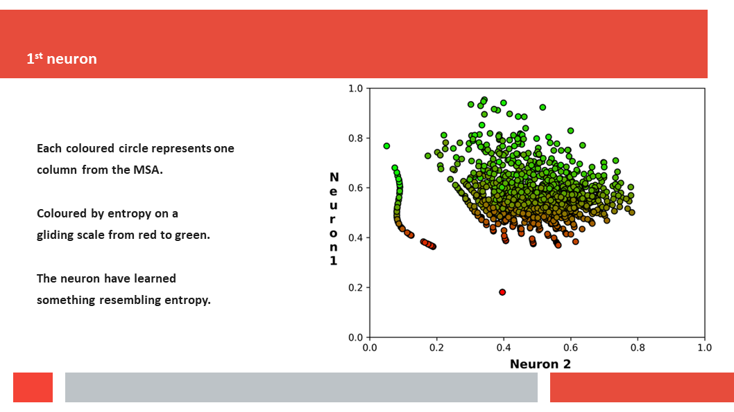
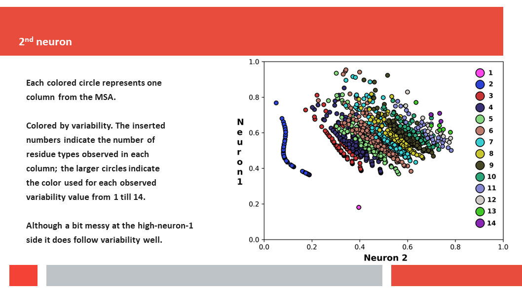
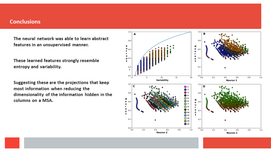
Figure 7. In this article we (Daniel who did the work, and Gert who talks about it) 
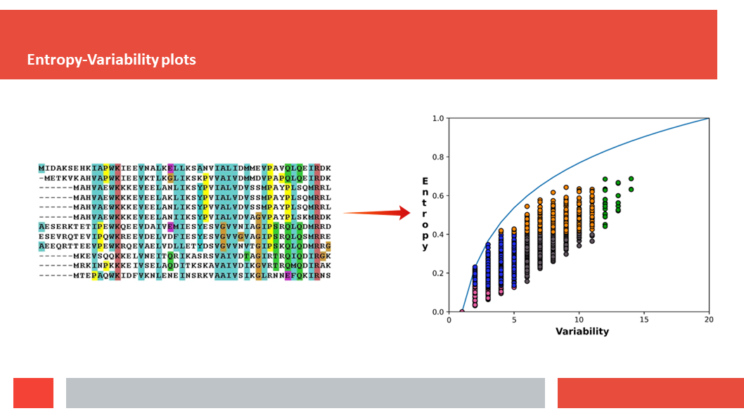
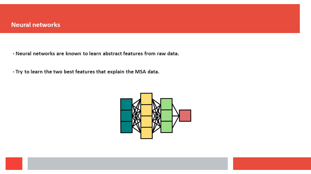
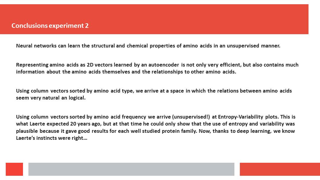
discuss how a deep-learning experiment on HSSP files for the entire human genome reveals that, just as Laerte Oliveira expected already 20 years ago, entropy and variability are the two variables that best describe the variability patterns in columns in MSAs.
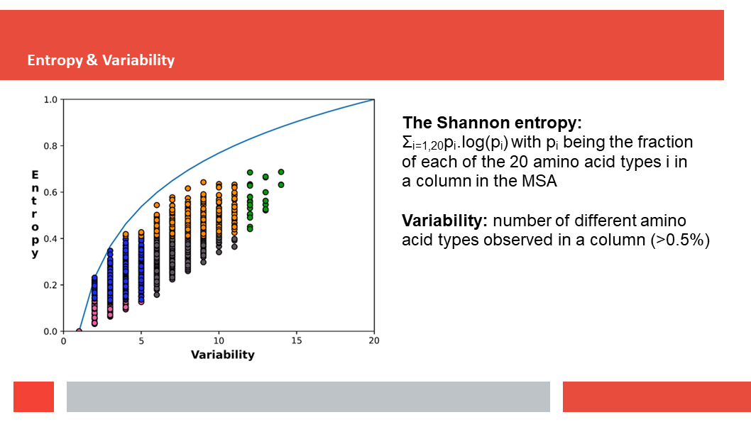
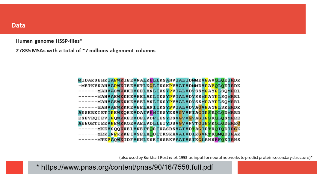
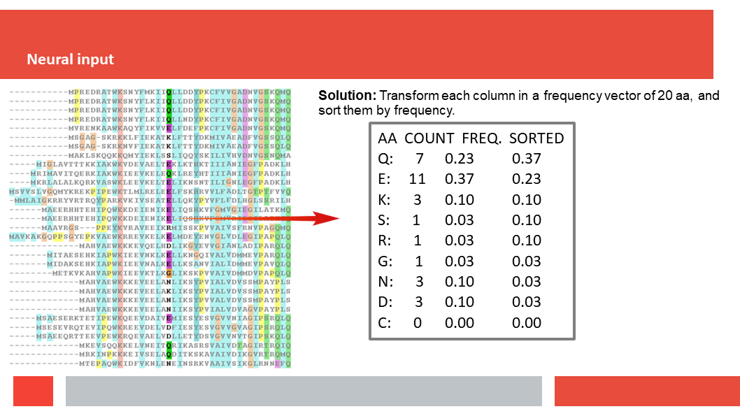
(HSSP files are MSAs without insertions. So if the sequence we start with is N amino acids long, and BLAST finds M homologs for us to align, tha the final MSA is a matrix of N by M+1; N colums of M+1 amino acids.) (Click on the image to start this seminar as a movie).

Figure 8. Laerte Oliveira found more than 20 years ago that the Entropy and Variability observed for column j in an MSA can be used to learn about the role of amino acid j in the protein. Today, twenty years later, we show that Entropy and Variability are the natural two variables to use when looking at variability patterns in columns of MSAs.

Figure 9. Left you see the top-left corner of a randomly chosen MSA. The plot at the right is a so-called EV-plot (EntropyVariability-plot; with Variability on the abscissa and Entropy on the ordinate. The colours in the MSA are a function of the residue′s property. The (colours in) the EV-plot are explained in the next slides.

Figure 10. In an EV-plot each dot represents one column in the MSA. And as the input MSAs are HSSP files, an MSA for a protein on N amino acids will have N colums and the corresponding EV-plot will hold at most N dots. We say ′at most N dots′ because any residue position j for which more than 10% of the aligned sequences have a deletion rather than an amino acid. The results are not different if this 10% becomes 1%, 5%, or 20%...

Figure 11. EV-plots were divided in five sectors by Laerte. The borders of these sectors are somewhat arbitrary. This seemed at first a weakspot in the EV-plot method. But it actually isn′t because residues near the borders between sectors have a mixture of the functions of those two sectors.
From bottom-left to top-right the roles of residues are: 11) active site; 12) support for the active site; 22) communication between 12 and 23; 23) modulator site (every protein with an active site has a modulator site too); 33) reserved by evolution for future use as Laerte jokingly used to say.

Introduction to the deep-learning aspects

Figure 12. In the second part of this seminar we explain how the deep-learning dimensionality reduction of the variability patters of MSA columns was performed.

Figure 13. When deep-learning is mentioned as method to extract generalisations from large data, people tend to immediately think about (very big) neural networks. We used another, simpler method.

Figure 14. The large input dataset consists of HSSP files for all 27835 human proteins from the hg19 set. HSSP files were introduced by Reinhard Schneider and Chris Sander in the 90′'s and found their first big application in Burkhard Rost′s famous secondary structure prediction software.
The 27835 HSSP MSAs contain in total around seven million columns.

Figure 15. Most computational methods including neural networks require numerical input. Our input consist of about seven million vectors of length 20. The 20 numbers in a vector are the frequencies pi for the twenty residue types i observed at the corresponding position p in the MSA. So, the values pi range from 0.0 to 1.0, and the sum of the twenty pi values typically is 1.0 (or a bit lower if deletions are observed in this column of the MSA).

Figure 16. We are interested in variability patterns, independent of which residue types are observed. So a column in an MSA that is 1/3 Ala and 2/3 Cys gives the same vector as a column that is 1/3 Arg and 2/3 Lys.
To make sure we analyse variability paterns, and not amino acid type distributions, these vectors are sorted.

Figure 17. The ~7000000 sorted vectors are then all multiplied with a 20*15 matrix to end up with vectors of length 15. This matrix is optimised to minimise the errors upon going back again from vectors of length 15 to length 20 with a 15*20 matrix (that is also optimised). Personally, I like symmetry so I would have liked it better if the 15*20 matrix would have been the inverse of the 20*15 matrix. Experienced people whose work it is to know such things made clear that two matrices that get optimised independently generally works better. And, as we have ~7000000 vectors as data, we don't care about 300 fewer or more optimisable parmeters. This 20->15 process is repeated for15->10, 10->5, and 5->2. The right hand side of the plot is just there to show what we do at the very end, because 2->5->1-->15->20 is done with the 15*20, 10*15, 5*10, and 2*5 matrices that were already optimised along the path 20...->...2. The strength of this auto-encoder is that the 20 dimensional data at some moment is represented in two dimensions in the red bottleneck vector of length two. Laerte would have said that this auto-ecoder had to do a lot of nifty things to arrive at the two smartest features.

Figure 18. This vector length reduction is done for 20->15, 15->10, 10->5, and 5->2. To do the training of the ~1000 parameter in the matrices efficiently, we need some nifty tricks. If all values fall between 0.0 and 1.0 then we can use cross-entropy to measure the dissimilarity between the original and reconstructed vectors. And that allows for very fast convergence. But: Since we want the matrix transformations to result in values that fall nicely between 0 and 1, we use two methods (batch-normalization and the sigmoid activation-function) to ensure this. Normally, the outputs of the matrix operations can have both negative and positive values and have bell curve distributions with varying centers and widths depending on the matrix used. The batch-normalization technique helps by transforming these distributions into bell curves with fixed center and width values. The Sigmoid activation-function, aka the logistic function, is a mathematical function that can transform values from standardized bell curves into values between 0 and 1. Another reason to use the Sigmoid function (or any other non-linear function) is to ensure that each layer of the neural network becomes non-linear, otherwise the 8 matrices could easily be reduced to a single matrix with the exact same result (which removes the benefit of having multiple layers).

Figure 19. The 20*15 matrix used to reduce the dimensionality from 20 to 15 and its 15*20 partner are optimised to get for all seven million alignment colums the frequency vector back as good as possible. In this figure the output vector matches the input vector perfectly. In practice things will not always be this nice, of course :-)

Figure 20. So, a small summary: at each dimensionality reduction (so 20->15, 15->10, 10->5, and 5->2) a reduction matrix is made together with its re-expansion partner. And these matrices are at each step calculated such as to minimise the error after complete reduction to two dimensions and re-expansion to 20 dimensions.

Figure 21. At the end we have four reduction matrices and four re-expansion matrices. And, of course, they will never lead to the perfect re-expansion shown in this figure :-)

Results. Or what did the method learn?

Figure 22. In this section we discuss the results of the dimensionality reduction to two dimensions if the 20D input vectors are sorted by residue frequencies pi.

Figure 23. This figure shows left the EV-plot and right the corresponding plot where each column is placed according to its first and second value (called neurons) in the 2D vector. Each dot corresponds to one column j in a HSSP MSA. Dots for the same column j have the same colour in both plots. Its is clearly seen that columns j that cluster in the EV-plot cluster in the 2D-plot too. (This example is for the protein SPG11).

Figure 24. This 2D-plot is the same as in the previous figure, but now the dots are coloured as function of the sequence entropy. The result is clear.

Figure 25. And if we colour the dots by the variability we get again a very clear result (except a bit of noise at the fringes, but the protein and the method are forgiven). (Please not that the highest variability observed was 14).

Figure 26. Summary. If we reduce the dimensionality of frequency vectors obtained from columns in MSAs from 20 to 2, then we end up with two dimensions that (in a non-orthogonal way) perfectly match Entropy and Variability. So, we see perfect convergence of real intelligence (Laerte) and artificial intelligence (the auto-encoder).

And now for something totally different.

Figure 27. In experiment 2 we don′t ask what the variability pattern does, but what the amino acids do in 2D.

Figure 28. If we are not interested in variability patterns but in patterns of observed exchanges between residue types, we can use almost the same method. Just don′t sort the 20 pi frequencies.

Figure 29. Everything then goes just as in the previous section we go again 20->15, 15->10, 10->5, and 5->2 with reduction matrices that upon re-expansion keep us closest to what we started with.

Figure 30. Since the frequency vectors are not sorted in this experiment, the neural network will learn something different than Entropy and Variability. By not sorting, the neural network can potentially learn about the properties of amino-acids and the relation between them. To visualize what it actually has learned, we plotted the whole learned 2-dimensional representation space (the 2 bottleneck neurons) back to the 20 amino-acids. In the image, plotted here as a heat map, you can see how strong each amino-acid is active/represented in the final auto-encoder layer given any combination of the 2 bottleneck neuron values.
In the resulting plot we see residues next to each other that we expect (based on our understanding of the physicochemical characteristics of the amino acids, and based on 30 years of experience in the field of mutating amino acids in proteins) to be next to each other. Obviously, things cannot be perfect because we have only 2 dimensions to display a 20 dimensional space, but this picture is pleasantly close to what GV teaches in his Bioinformatics 1 course.

Figure 31. In this plot we see many things ′as expected. The hydrophobics are at the one side, the hydrophilics at the other side, and the special ones in the middle. The hydrophobics seem sorted by size, with the aromatics on top. Met is a bit out of line as it is a) the start codon, so more often observed at the surface than its hydrophobicity suggests, and b) because of its sulphur must be close to Cys.

Figure 32. The positives cluster, and so do the negatives. His sits a bit inbetween as it can be positive and negative (and neutral).

Figure 33. The polar ones sit between the charged ones and the special ones. Ser and Thr sit next to each other with the slightly more hydrophobic Thr at the hydrophobic side of the plot. The small residue Ser sits nicely between the other two small ones (Gly and Ala).

Figure 34. The special ones (Cys, Pro, Gly) cluster.
Pro reduces protein flexibility by its backbone and Trp by its big rigid side chain. These two are neighbours too.

Figure 35. Many relations between amino acids that we teach in Bioinformatics 1 can be found back qualitatively in this plot. But it is known that neural representation often also describe semantic relations between objects.

Figure 36. And indeed, there are three situations in which residues are very similar but differ by just one -OH group: Ala->Ser, Val->Thr, and Phe->Tyr. These three pairs have the same relation between them in the figure. The Val->Thr vector is a bit longer because it doesn′t add a -OH, but replaces a-CH3 with a -OH.

Figure 37. Asp, Asn, Glu, and Gln are all four a bit similar. The relations: Asn->Asp and Gln->Glu where neutral residues become negatively charged indeed require the same vector in the 2D plot.

Figure 38. And so do the relations Asn->Gln and Asp->Glu where in both cases the side chain gains one -CH2- group.

Figure 39. And that brings us to the conclusions.